

Amtruck Brand Collateral Case Study ✧
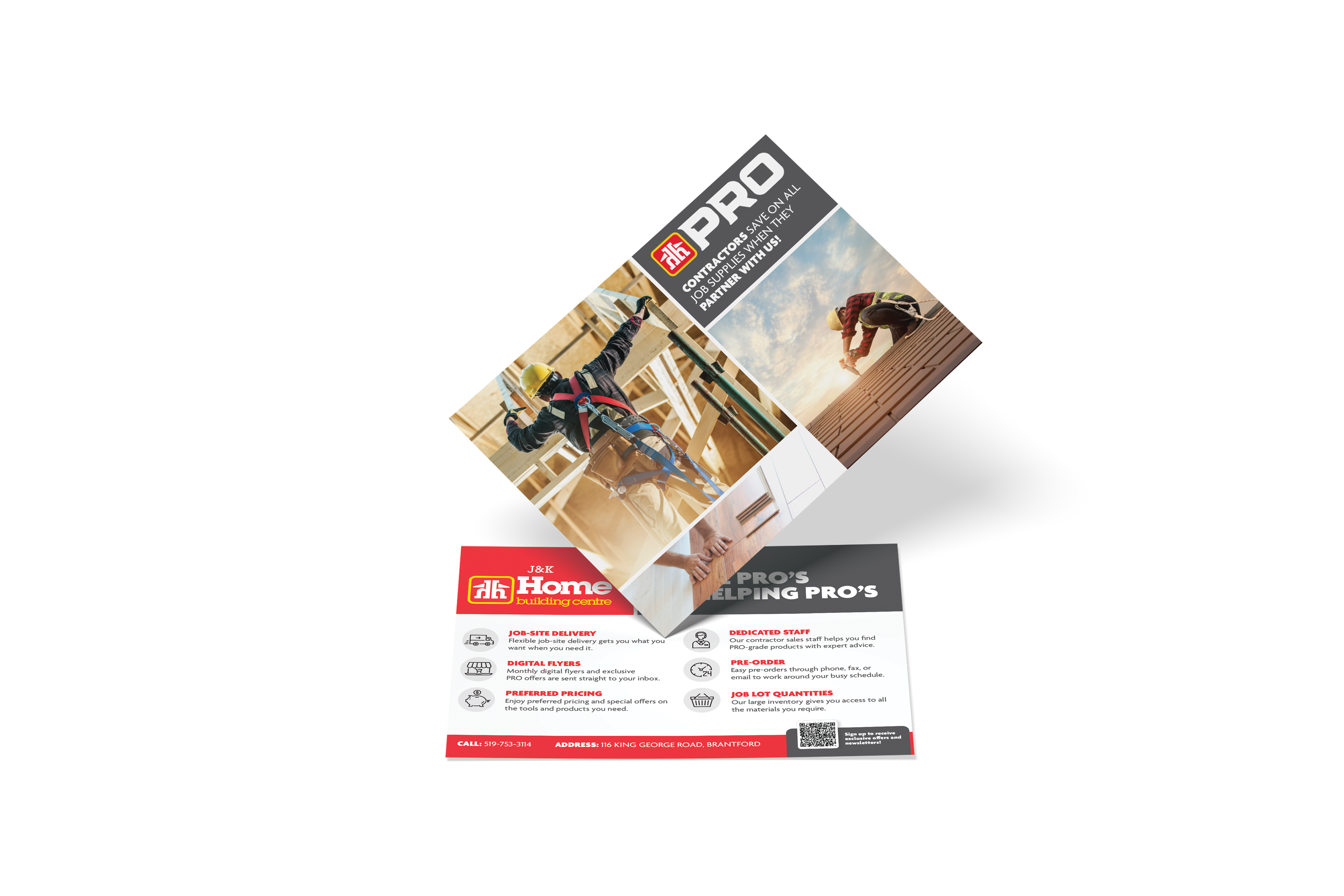
Tasked with refreshing an existing company brochure, I redesigned Amtruck's marketing collateral to create a more modern, visually engaging piece while maintaining brand consistency. The original brochure relied on a traditional layout and dense content structure, so I focused on improving information hierarchy, readability, and visual impact.
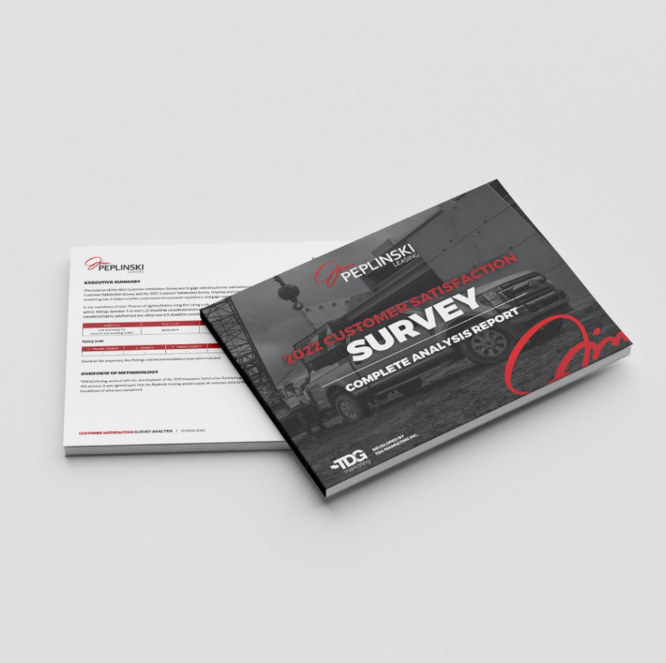
See Figure A.
✧ The Real Life Strategy
The redesigned piece featured updated typography, stronger use of imagery, and a cleaner overall composition that better showcased Amtruck's services and fleet offerings. The final design was later expanded into pull-up banner graphics for a trade show, providing the company with a cohesive and professional presence across multiple marketing applications.
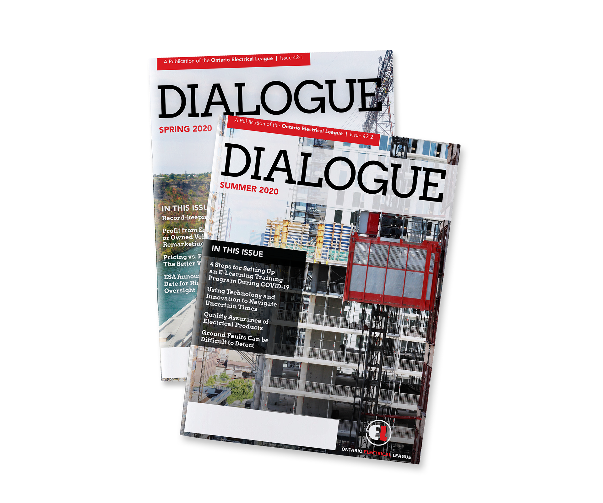
See Figure B.

Figure A
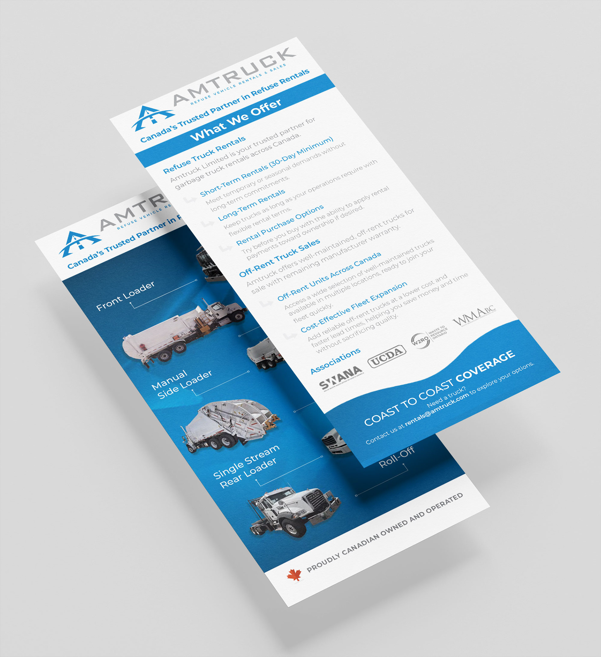
Figure B
The Outcome ✧
Modernized existing marketing collateral
Improved visual hierarchy and readability
Created assets suitable for both print and trade show environments
Extended the design system into large-format event signage
Delivered a cohesive brand experience across multiple touchpoints

Logo Development Case Study ✧
Overview
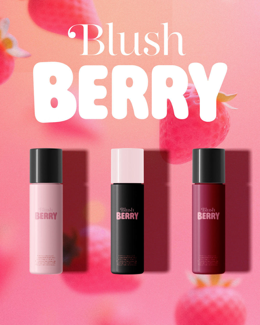
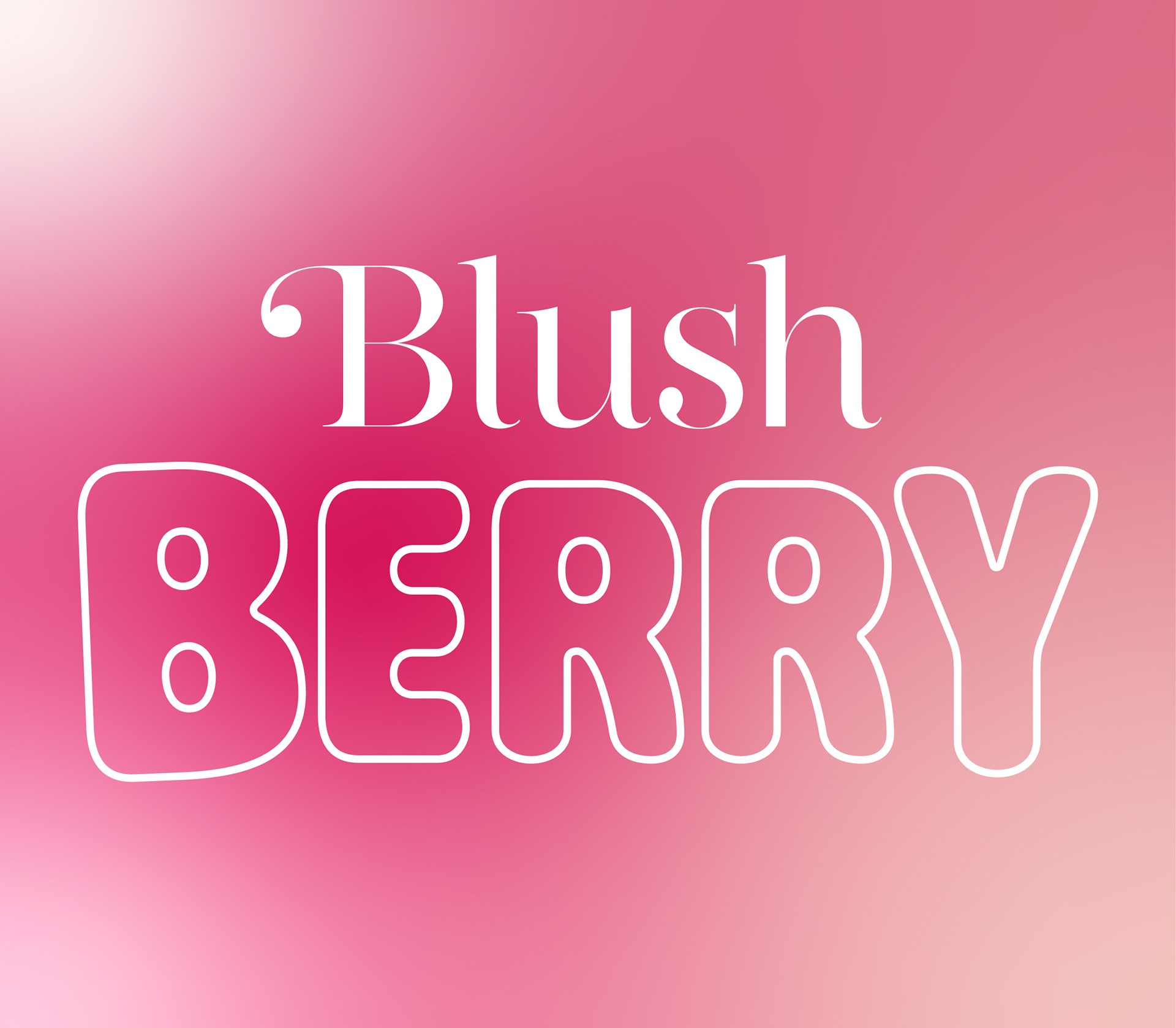
Blush Berry is a fictional makeup brand created to explore playful, youth-focused beauty branding. This concept let me experiment with soft shapes, bright berry tones, and a fun, expressive visual style aimed at a Gen Z audience.
Blush Berry is a fictional makeup brand created to explore playful, youth-focused beauty branding. This concept let me experiment with soft shapes, bright berry tones, and a fun, expressive visual style aimed at a Gen Z audience.
Approach
The identity is built around rounded typography, sweet colour palettes, and sticker-style graphics that capture the energy of self-expression. The goal was to keep the brand bold and vibrant, while still clean and cohesive across packaging and social applications.
The identity is built around rounded typography, sweet colour palettes, and sticker-style graphics that capture the energy of self-expression. The goal was to keep the brand bold and vibrant, while still clean and cohesive across packaging and social applications.
Key Elements
Bubbly logotype, Berry-inspired colour palette, Sparkles, swatches, with playful accents and Packaging + social media mockups.
Outcome
Blush Berry showcases my ability to design for beauty and lifestyle brands with a youthful, colourful direction. It reflects how I build full brand worlds — from logo to visuals to real-world applications — even within a conceptual project.
Blush Berry showcases my ability to design for beauty and lifestyle brands with a youthful, colourful direction. It reflects how I build full brand worlds — from logo to visuals to real-world applications — even within a conceptual project.
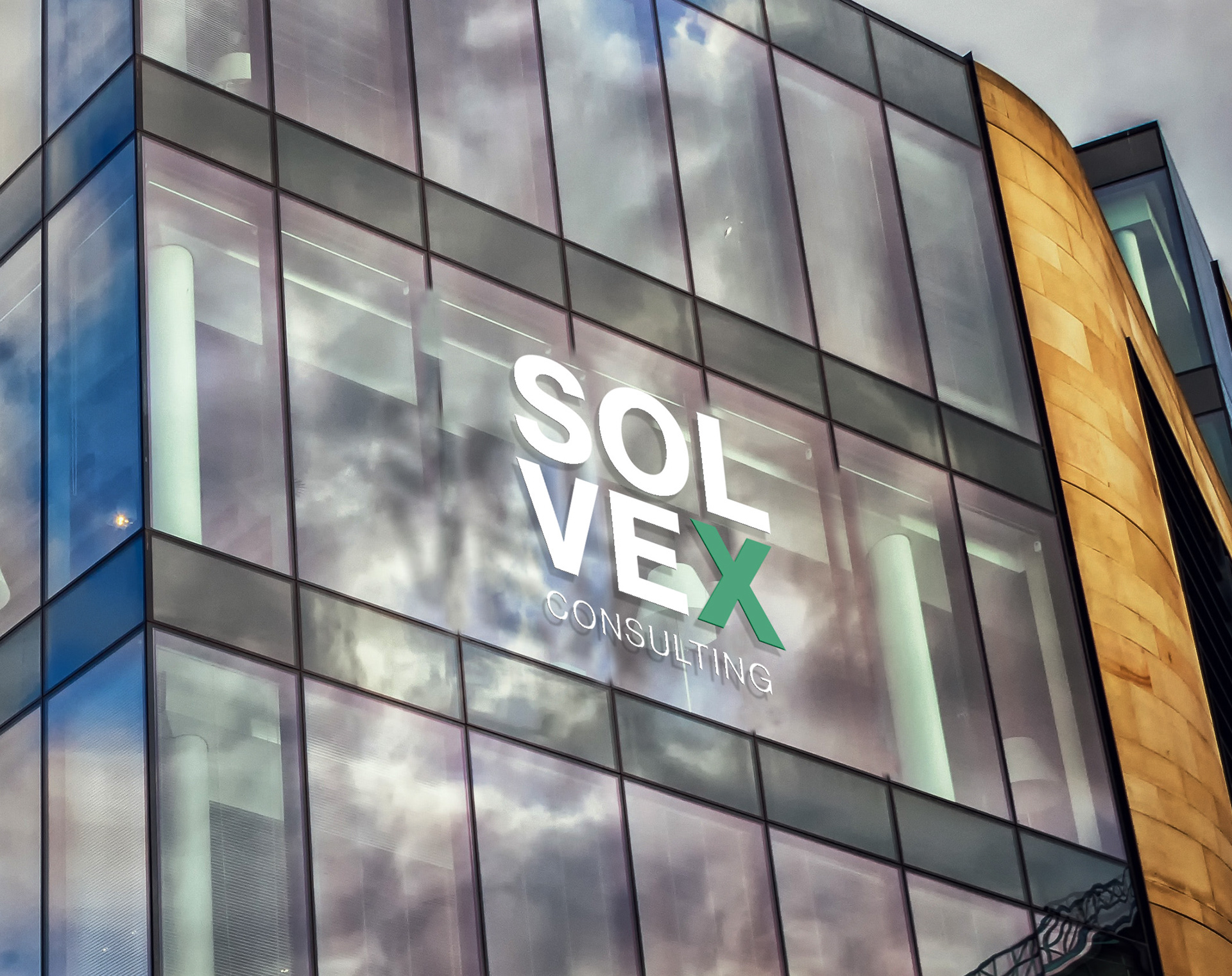
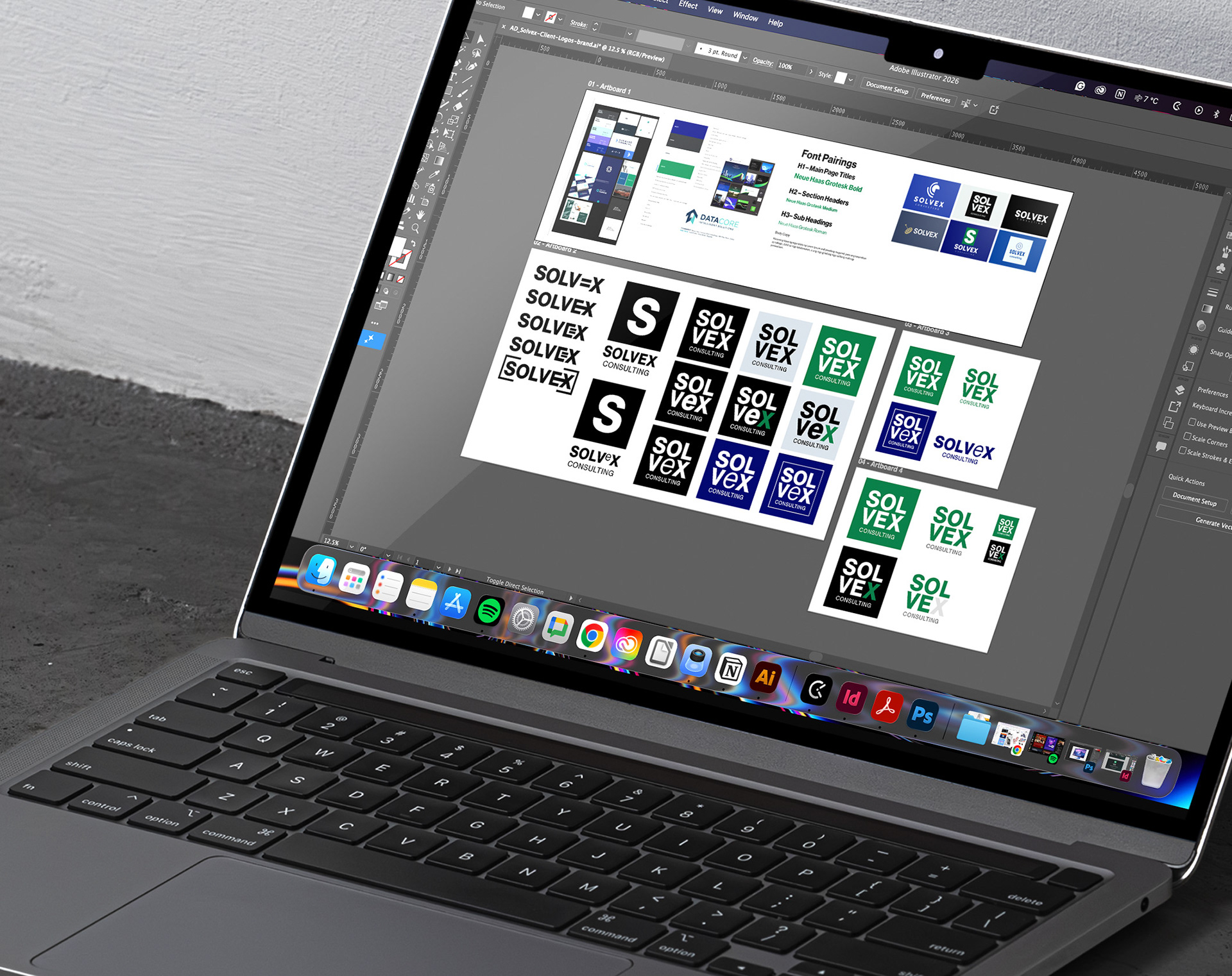
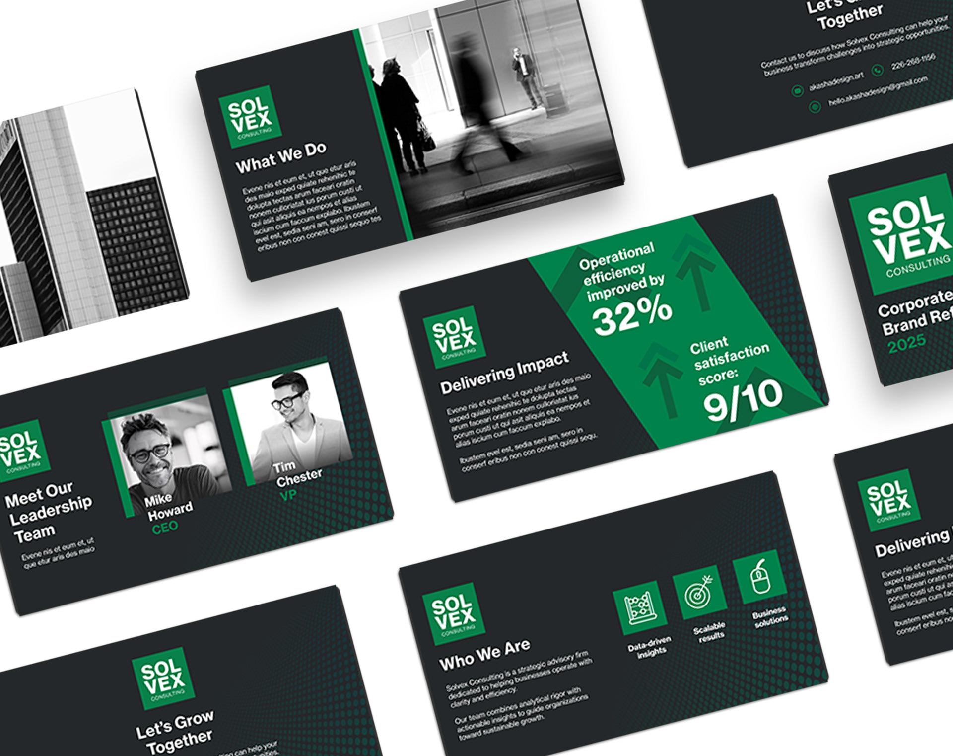
Solvex – Logo & Slide Deck Design
I created a modern, streamlined logo for Solvex that reflects clarity, innovation, and forward momentum. The design pairs bold, clean typography with a simple geometric icon, creating a professional visual identity that works across both digital and print.
To support the brand, I designed a polished slide deck using the new color palette, layout system, and visual style I sourced through a moodboard. The deck focuses on strong hierarchy, clear communication, and a cohesive look that elevates Solvex’s presentations and messaging.
A concise, cohesive identity system that helps Solvex show up with confidence and consistency.

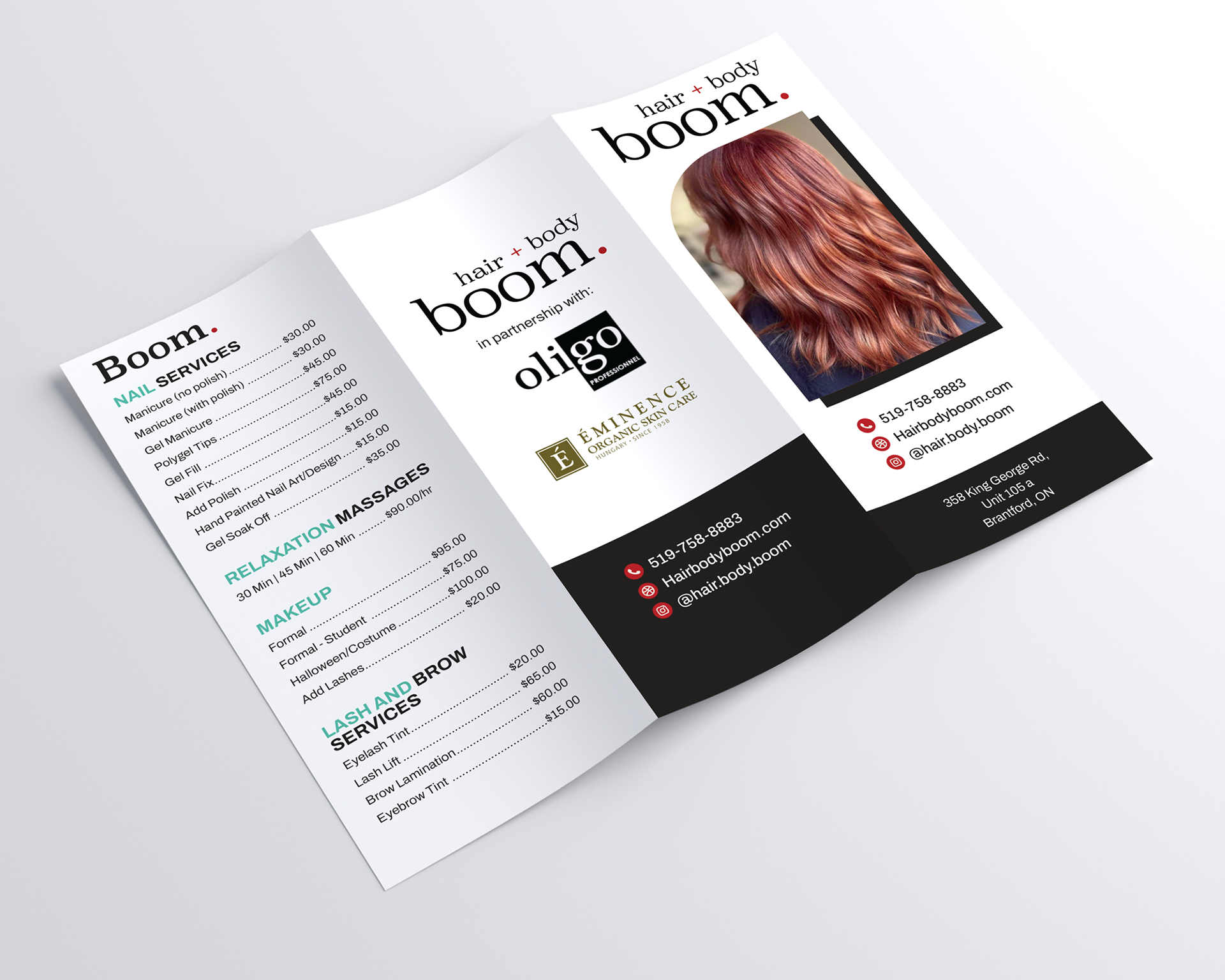
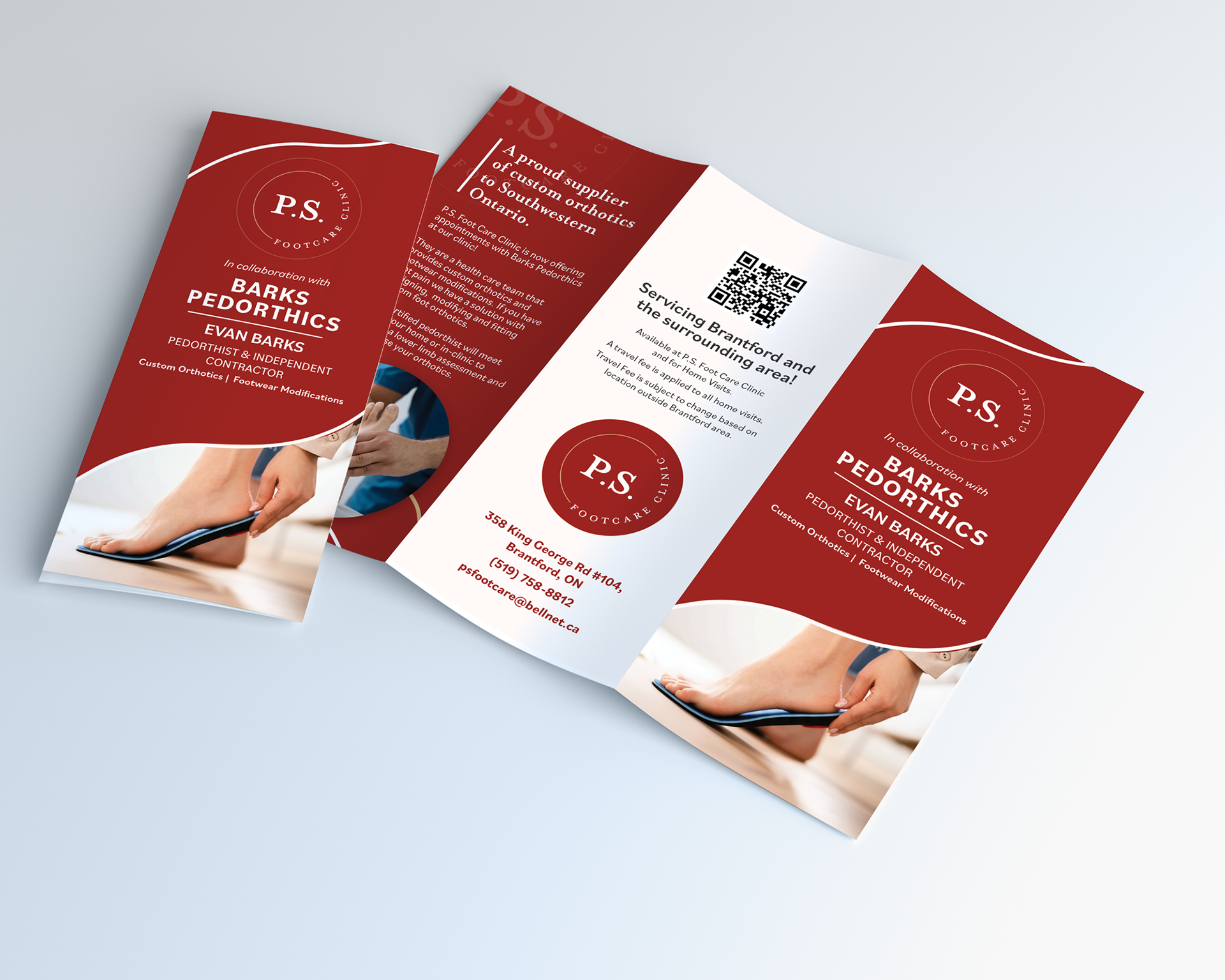
Portfolio Examples ✧